About
Family
UW Photos
SPUD:Scuba Picture
'Uv' the Day
Flower Gardens
Aquashot
Trip Reports
RSDiver
Photo Instruction
Introduction
Equipment & Film
5 Ways to Improve
Composition 101
The Very Basics
Lenses & Apertures
Smile!
Tools
Good/Bad/Ugly
Exposure 101
Using Strobes
Diving with a Camera
Special Techniques
Evaluating Photographs
Homework
Camera Maintenance
The Digital Photographer
Equipment Appendices
Glossary & Index
Recommended Reading
Message Board
Other Resources
News
Wallpaper Images
Software
Site Map
Search This Site:

The Basics of Composition

There are really only a few rules in composition, and even those rules are malleable. I tried to distill the basics down to three easily-remembered rules, but it's not quite that easy. However, I did manage to get it down to three basics and a few assorted small suggestions/recommendations. Here goes.

1. Feature the subject.

Every picture has to have a subject--the subject is what makes the picture interesting. If your viewers can't figure out what the subject is, your picture has basically failed. The subject should, in most cases, just about grab the viewer's eyeballs and shout into their ears "I'm the subject! Look at me!" You, as the photographer, have the job of making sure the subject does that. Sometimes that's an easy task; a whale shark in blue water is hard to miss. Other times, it's more difficult; a camouflaged creature can be difficult to pick out from a busy background.

peppermint.jpg (15851 bytes)
The peppermint goby is too small to make an effective subject. Can you even find it?

french-stetson.jpg (41394 bytes)
Now we're talking! There's no question what the subject is.

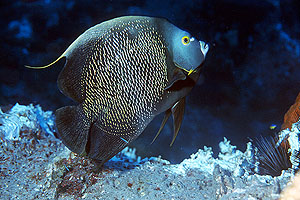
There are several parts to featuring the subject. First off, when you're framing up a picture, make sure that the subject is a sizable portion of the frame. I'd say that one quarter to one-third of the frame is sort of bare minimum. There are exceptions, of course, but 1/4 to 1/3 is a good rule of thumb. Next, be wary of coral or sand backgrounds for your subject. Blue water is much better. That's not to say that you can't have coral in the picture, but it's generally better to have your subject above or next to the coral, with blue water behind it. A very easy way to avoid cluttered backgrounds is an often-repeated rule for underwater photography: shoot from below your subject, aiming up towards the surface. Of course I'm not suggesting you take pictures of fish bellies, so don't over-emphasize this rule. Just a few degrees of incline below your subject is all it takes. There are other reasons for shooting upwards, including getting brighter water for a background, taking advantage of surface effects, and the observation that it's easier to approach fish from below.

Lighting is also an important part of featuring the subject, but the details of lighting are another subject for another section. Just remember to light your subject appropriately.

Finally, there's a very important rule for featuring the subject: make sure that you can see the subject's eye, and that it is in focus. "Eye contact" with the viewer is essential. Whether shooting fish, octopus, turtles, or people, the eyes have it. If your viewers can't see the subject's eye, they won't have good contact with it. Just having the eye visible is not good enough; you must ensure that the eye is in sharp focus. There's only one reliable way to do this: focus on the eye, every picture, every time. If you can focus on it, you can see it. You've killed two birds with one stone by remembering that rule.
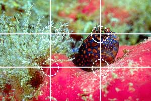
durgon.jpg (65155 bytes)
Aim down, and you get a subject that blends in to the background.
queen-midwater.jpg (18771 bytes)
Get down, aim up, and you get a distinct subject.

2. Don't Center

This is the most common compositional mistake made by new photographers, and one I make myself even now. Centering a subject seems like a good thing to do, but it's not. Unless you're shooting portraits, centering is bad. Why? Because the viewer's eye gets stuck "on center," and the rest of the frame may as well be wasted. For portraits, that's just what you want. But for most photographic work, the rest of the frame is important to the overall experience. The material around the subject sets the scene for the subject, so the viewer has a chance to place the subject in an environment, which in turn lets the viewer imagine the gestalt experience of being there when the picture was taken.

If you're not going to center the subject in the frame, where do you put it? Now is the time to introduce the Rule Of Thirds. Imagine a tic-tac-toe grid drawn on your camera's viewfinder, splitting the frame into thirds both horizontally and vertically. What you want to do is place your subject on one of the four points where the lines intersect. It usually doesn't matter strongly which of the four intersection points you choose, although there are exceptions. You generally want the subject to be moving into the frame, towards the center, so if your subject is a fish you'll usually want to place the fish on the point that has it swimming into the frame. If you're trying to photograph the fish fleeing from the frame, then put in on a point that has it swimming out of the frame.

It's worth mentioning that exact placement on a rule-of-thirds point is not critical; just somewhere "near" the desired point is good enough.

If you're doing fish portraits, there's a slight modification to the rule of thirds. Obviously, if you want to fill the frame with your subject, which is the right thing to do with portraits, you can't exactly put the subject on a rule-of-thirds point. In this case, putting the eye of the fish on a rule-of-thirds point often works pretty well.

rule_of_thirds.gif (2275 bytes)
The Rule Of Thirds grid

tess_blenny_thirds.jpg (26327 bytes)
The blenny's eye is in just the right spot.

vertical-thirds.jpg (28465 bytes)
The rule of thirds applied to "vertical" pictures

3. Beware of Lines

Lines are a powerful feature in any photograph. They draw the viewer's eye along the line, and then the eye keeps travelling past the end of the line. But lines can be a bad thing, too. Specifically, vertical and horizontal lines often add an element of symmetry that is comnpletely undesired. Unless you're photographing a man-made object or the horizon, you probably want to avoid horizontal lines.

If there's a line of some sort in the photograph, you're probably best off arranging it to be diagonal. Here are some examples of good and bad use of lines.

spotmoray.jpg (42622 bytes)
The vertical positioning of the moray looks really unnatural.
oceantrig.jpg (44600 bytes)
The diagonal line frames up the triggerfish and suggests a swimming direction.
hooker-1a.jpg (10155 bytes)
The parallel diagonal lines of the wreck and the barracuda are super dynamic.
diver-silhouette.jpg (11733 bytes)
One of my favorite composition jobs. Diagonal line from the reef, a good silhouette, and the diver is on the thirds.
flamingo5.jpg (26775 bytes)
Could this one be worse? Probably not.

Next Chapter | Back to Composition 101


About | UW Photos | Scuba Picture Uv the Day | Flower Gardens | Aquashot | Trip Reports | RSDiver | Photo Instruction | News | Desktop/Screensaver Images | Site Map